The Complete WordPress Image Optimization Guide: WebP, AVIF, and Beyond
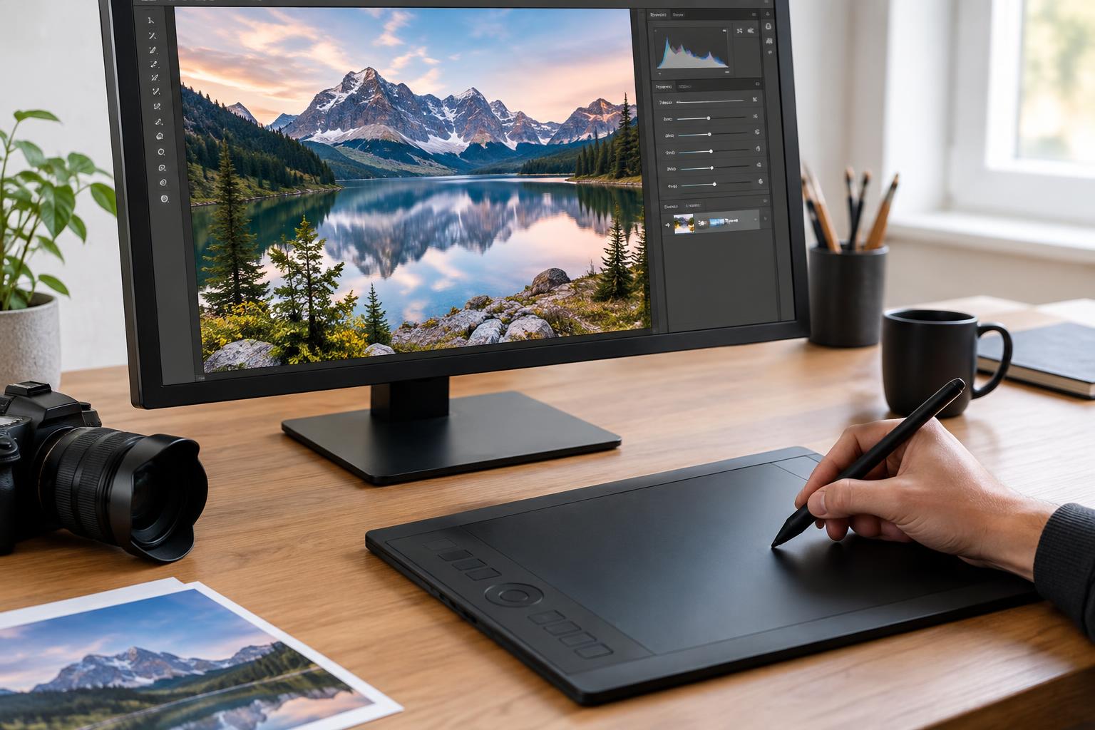
Images often account for a substantial portion of what a WordPress page must download. A sharp hero photograph, detailed product gallery, or image-heavy blog post can look excellent while quietly making the page slower than it needs to be. The answer is not to remove useful visuals or compress every file until it looks damaged. Effective WordPress image optimization matches each image to its purpose, displayed dimensions, format, quality level, and loading position.
A dependable workflow has several layers: upload appropriately sized source files, choose a suitable format, compress them carefully, let WordPress provide responsive variants, defer images that begin outside the viewport, and verify the result on real page layouts. WebP and AVIF are important parts of that workflow, but neither format can compensate for an image that is far larger than its rendered size or loaded at the wrong time.
Quick Answer
For most WordPress sites, use WebP as a dependable modern default, consider AVIF where your delivery system and quality testing support it, retain PNG or SVG for graphics that genuinely need them, and resize every image for its actual layout. Combine compression with responsive image delivery and selective lazy loading, then inspect important pages visually and measure them before deleting original files.
Key Takeaways
- Choose formats according to image content, transparency, compatibility, and visual quality.
- Resize images before relying on compression to reduce their file size.
- Use responsive image variants so small screens do not receive unnecessarily large files.
- Lazy-load below-the-fold images, but avoid delaying the main image visible at page load.
- Test representative pages and keep recoverable originals before bulk conversion or deletion.
Why Image Optimization Is More Than File Compression
Image optimization is the process of reducing unnecessary image data while preserving the appearance and function required by the page. It includes dimensions, file format, compression, responsive delivery, loading behaviour, caching, and quality assurance. A smaller file is useful only if it remains visually acceptable and is delivered correctly.
Consider a homepage banner exported at 4,000 pixels wide but displayed at approximately 1,400 pixels on a desktop layout. Converting that original directly to WebP may reduce its file size, yet visitors still receive more pixel data than the design requires. Resizing it first, creating appropriate variants, and then compressing those variants addresses the underlying problem rather than only changing the file extension.
WordPress also creates attachment records and intermediate image sizes when files are uploaded. Themes, page builders, ecommerce templates, and plugins may request these sizes differently. That is why a broader WordPress image management process still matters: optimization needs to account for uploads, reusable media, crops, metadata, and files that are no longer attached to visible content.
At WPAssist, one of the first things we compare is the image’s intrinsic dimensions against its rendered dimensions on the page. A healthy server response or a modern file format does not prove that image delivery is efficient. Oversized source files, duplicate downloads, or a poorly prioritized hero image remain separate places to investigate.
Which Image Format Should You Use in WordPress?
There is no single best format for every image. Photographs, transparent graphics, logos, screenshots, illustrations, and animated assets contain different kinds of visual information. The practical goal is to select the format that produces acceptable quality at a reasonable size while remaining compatible with the site’s editing and delivery workflow.
JPEG for conventional photography workflows
JPEG remains useful for photographs and complex images without transparency. It is broadly supported by browsers, design tools, content systems, and external platforms. If a site has an established JPEG workflow, those files do not automatically become a problem. Properly resized and compressed JPEG images can still perform well.
Its limitations become more noticeable around text, interface elements, sharp edges, and repeated editing. Heavy compression can introduce blockiness, colour banding, or halos. Saving an already compressed JPEG repeatedly can compound visible damage, so it is better to create new outputs from a high-quality original rather than continually editing the delivered file.
PNG for transparency and crisp graphics
PNG is appropriate when lossless detail or transparency is important, including some logos, diagrams, interface graphics, and screenshots. It can be unnecessarily large for full-colour photography, however. A product photograph saved as PNG may carry significantly more data than a visually comparable photographic format.
Before converting every PNG, inspect why it exists. A transparent product cut-out may need its alpha channel. A screenshot containing small text may show artifacts if compressed too aggressively. A decorative photograph exported as PNG, by contrast, is a strong candidate for conversion.
WebP as a practical modern default
WebP supports photographic images, transparency, and both lossy and lossless workflows. For many WordPress sites, it is a sensible default for newly generated web derivatives because it can often reduce file size while maintaining comparable visual quality. It is widely supported in current browsers, and many image optimization systems can generate it automatically while preserving an original file or fallback.
WebP should still be judged image by image. Fine gradients, brand colours, tiny text, and sharp product details can respond differently to the same quality setting. Use representative samples rather than assuming one global compression number will suit every part of the site.
AVIF when efficiency justifies more testing
AVIF can produce very efficient outputs, particularly for certain photographic images, gradients, and complex scenes. It may deliver a smaller acceptable file than WebP, but the winning format depends on the image and encoder settings. AVIF generation can also demand more processing time, and an aggressive conversion may soften details or create artifacts that are easy to miss in a thumbnail.
A modern format is not automatically an optimized image. AVIF at excessive dimensions or unnecessarily high quality can be heavier than a carefully prepared WebP or JPEG. Format selection comes after deciding how large the image needs to appear and what visual detail the page must preserve.
For a small business site, WebP may offer the simpler operational choice. An image-heavy publication or WooCommerce catalogue may benefit from testing AVIF as the preferred output with another format available where needed. Confirm that the WordPress version, media workflow, conversion plugin, caching layer, CDN, and browser delivery rules all agree on which file should be served.
SVG for suitable vector artwork
SVG can be ideal for logos, icons, and diagrams built from vector shapes because it can scale without the pixel dimensions required by raster files. It is not a replacement for photographs. SVG uploads also require a deliberate security policy because the format can contain code-like content; do not enable unrestricted uploads merely to reduce a logo’s file size. Use trusted files, sanitize them through an appropriate workflow, and restrict who can upload them.
How Should You Resize and Compress Images?
Start with dimensions, not a compression slider. Determine the largest width at which the image will actually render, including wider desktop layouts and high-density displays where applicable. Preserve the aspect ratio unless the design requires a defined crop. Then generate the sizes needed by the theme rather than uploading one enormous file for every context.
Image dimensions and compression settings affect both file size and visible quality. As web.dev’s image performance guidance explains, testing compression levels helps find a suitable balance between quality and file size. Optimization is therefore a measured compromise, not a race toward the smallest possible number.
Match dimensions to the design
Suppose a staff profile photograph appears at 480 by 480 pixels on large screens. Uploading a 3,000 by 3,000-pixel original without creating an appropriate derivative wastes bandwidth, even if the original is compressed. A prepared square source with enough detail for the intended display and a suitable responsive variant will usually be more efficient.
Do not resize every file to one universal width. A full-width banner, two-column feature image, thumbnail, logo, and product zoom image serve different purposes. Document common layout slots and their aspect ratios so designers and content editors know what to prepare before upload.
Choose compression by content type
Lossy compression discards image information to reduce size. It suits many photographs when used carefully. Lossless compression retains image data and is valuable where exact edges, transparency, or repeated editing matters, though the resulting file may be larger. WebP and AVIF can participate in either kind of workflow, depending on the encoder and settings.
A useful test set includes a bright photograph, a dark photograph, a face, a product with fine texture, an image with a smooth gradient, and a graphic containing small text. Export each at a few quality levels, compare them at the size visitors will see, and inspect the areas most likely to reveal damage. Once a reasonable baseline is found, use it as a starting point rather than an unbreakable rule.
Protect source files before bulk processing
Bulk optimization changes many assets quickly, which also means a poor setting can affect many pages quickly. Create a current backup of the site and media files, confirm that it can be restored, and understand whether the optimization tool keeps originals. Storing an original does use space, but deleting it immediately removes an important recovery path.
WPAssist favours testing a controlled batch before converting an entire media library. Start with several representative images and pages, clear the applicable cache, inspect the generated markup and files, and compare the live result. Only then should the same policy be expanded to older media.
How WordPress Delivers Responsive Images
Responsive image delivery allows a browser to choose among multiple image resources instead of receiving the same large file at every screen size. WordPress can generate several intermediate sizes and add srcset and sizes information to image markup. Its official developer documentation explains how responsive image selection helps the software display an appropriate resource according to the device’s screen size.
Responsive delivery solves a different problem from compression. Compression reduces the data within an image file; responsive delivery helps the browser choose a file with suitable dimensions. A strong image workflow normally uses both.
WordPress can only choose from sizes that exist and are represented accurately in the markup. If a theme requests the full-size upload, uses an image as a CSS background, or declares misleading layout dimensions, the browser may not receive an effective choice. Background images and sliders deserve particular attention because their loading logic may sit outside the standard media block behaviour.
Check the file actually delivered
Do not judge responsive behaviour solely from the Media Library. Open a representative page in browser developer tools, inspect the image element, and check the requested file at different viewport widths. Compare its intrinsic dimensions with the rendered box. A small difference can be reasonable for density and layout flexibility; a multi-thousand-pixel file displayed as a small card is a warning sign worth investigating.
Also watch for duplicate downloads. A page builder may insert one desktop banner and one mobile banner, then hide one with CSS. If both files are requested, the visitor still pays the download cost. Proper conditional markup or responsive image rules are preferable to merely making one image invisible.
Regenerate sizes after changing the design
When a theme adds new image dimensions, existing uploads may not automatically have those derivative files. Regenerating thumbnails can create the newly required sizes, but it should be treated as a controlled change. Back up first, confirm the configured dimensions, assess storage requirements, and test crops on real content. Automated centre cropping can remove a person’s face, a product feature, or text near an edge.
Where Does Lazy Loading Help or Hurt?
Lazy loading defers images outside the user’s initial viewport until they approach visibility. The browser behaviour described by web.dev means that a below-the-fold image marked for lazy loading is not fetched immediately and is instead loaded as the visitor scrolls closer to it. This can reduce unnecessary initial work on long, image-heavy pages.
The key phrase is “below the fold.” The main hero image, a product image visible immediately, or another likely Largest Contentful Paint candidate should not usually be delayed in the same way as an image near the bottom of the page. Applying lazy loading indiscriminately can postpone a critical visual and make the page appear slower even if less data begins downloading initially.
For example, imagine a WooCommerce category page with a heading, introductory copy, and the first row of products visible on load. Product images farther down the grid are natural lazy-loading candidates. The leading visible product images may need earlier loading, depending on the layout and browser behaviour. Test the actual template rather than relying only on a global switch.
Avoid competing optimization layers
WordPress, a theme, an optimization plugin, and a CDN may each offer lazy loading or image rewriting. More than one layer is not automatically better. Competing scripts can replace markup twice, generate placeholder issues, or make debugging difficult. Establish which component owns format conversion, responsive variants, lazy loading, and CDN delivery.
Use exclusions deliberately. A logo does not need to be excluded merely because it is important to the brand; its location and loading impact matter. Conversely, a carousel’s first visible slide may require different treatment from later slides even though all of them belong to the same component.
How Do You Implement Image Optimization Safely?
A safe implementation begins with an inventory and a small test set. Avoid installing several overlapping optimization plugins and enabling every feature at once. That makes it difficult to determine which layer changed a URL, altered the markup, or caused a visual regression.
1. Establish a baseline
Select several important templates: the homepage, a service page, a long blog post, a landing page, and, if applicable, a product and category page. Record which images are large, which are loaded first, their rendered dimensions, and any visible quality concerns. Performance tools can identify candidates, but a warning is not proof that one file caused the entire page experience.
2. Define an image policy
Write down the preferred source dimensions for common placements, default output format, fallback behaviour, compression approach, and rules for retaining originals. Include exceptions for logos, transparent graphics, screenshots, product zoom images, and downloadable assets. This turns optimization from an occasional cleanup into a repeatable publishing process.
3. Confirm backup and rollback options
Create a recoverable backup before bulk conversion, database cleanup, URL rewriting, or thumbnail regeneration. Determine how to restore individual media files as well as the whole site. If the conversion tool stores originals in a separate directory, confirm that directory is included in backups rather than assuming it is protected.
4. Test one conversion layer
Choose a single primary system to generate or serve modern formats. It may process files during upload, optimize existing media in batches, create alternatives on demand, or negotiate delivery through a CDN. Each model can work, but the team should know where generated files live and what happens when the tool is disabled.
Run a small batch, clear page and CDN caches, then inspect the public page in more than one current browser. Confirm that image URLs resolve, transparent areas remain transparent, and protected or logged-in pages behave as expected. If a site uses external image storage, verify that the conversion system can access and purge those assets correctly.
5. Expand gradually and monitor
Process the library in manageable groups instead of launching an unattended conversion shortly before a campaign. Large libraries can consume server resources or encounter timeouts. After each batch, inspect key templates, monitor errors, and confirm that storage growth matches expectations.
WPAssist treats image changes as part of the wider performance stack. Page caching, CDN rules, theme markup, hosting limits, and third-party scripts can influence what visitors ultimately receive. If the image files look healthy but a page remains slow, images are only one of the first areas to investigate—not automatic proof of the bottleneck.
How Can You Verify Image Quality and Performance?
Optimization is complete only when the delivered result has been checked. Review file size, intrinsic and rendered dimensions, format, request timing, visual quality, and layout behaviour. Test a fresh visit rather than relying entirely on a warm browser cache, and include both desktop and mobile-sized viewports.
Inspect visible quality at the intended size
Look for blockiness around edges, banding in skies or gradients, smeared hair and fabric, ringing around high-contrast text, altered brand colours, and lost transparency. Product images deserve careful comparison because texture, finish, colour, and small construction details may influence a purchase decision.
Do not evaluate only at extreme zoom. Visitors normally see the image within a layout, so the primary decision should be based on that presentation. Zooming remains useful for identifying artifacts, but it can make harmless differences seem more important than the page experience.
Check loading behaviour and layout stability
Confirm that the main visible image starts at an appropriate time and that below-the-fold images wait without leaving disruptive gaps. Image elements should have dependable dimensions or aspect-ratio space reserved so surrounding content does not jump when files arrive. A layout shift may come from an image, but it can also originate from fonts, banners, embedded content, or dynamically inserted elements.
For the largest visible image, investigate the complete request path. Check whether it appears directly in the initial HTML, is introduced later by JavaScript, is unnecessarily lazy-loaded, or waits behind other resources. A small file can still appear late if the browser discovers it late.
Use this final verification sequence
- Open representative pages in a private browsing session.
- Check desktop and narrow mobile viewport layouts.
- Confirm the delivered format and requested dimensions.
- Compare key images with the approved originals.
- Inspect the first visible image separately from below-the-fold images.
- Clear relevant caches and repeat the test after deployment.
- Keep rollback files until the optimized pages have remained stable.
If the mobile page receives a much larger file than it displays, fix responsive sizing before chasing minor compression gains. If the hero image begins late, review lazy loading and resource discovery. If product details look soft, increase quality for that image class rather than abandoning optimization across the entire site.
What Should WooCommerce Stores Handle Differently?
WooCommerce stores often reuse one product image in catalogue cards, search results, related-product sections, galleries, carts, and zoom views. The appropriate dimensions and quality can differ across those contexts. A small catalogue card should not receive the same oversized source required for a detailed product zoom.
Standardize product photography before upload where possible. Consistent aspect ratios reduce unpredictable crops and make catalogue grids easier to optimize. Preserve sufficient detail for the main product page, but generate smaller variants for listings and recommendations. Test transparent product cut-outs, swatches, variation galleries, and externally hosted images separately.
A practical scenario is a clothing store with 1,000 products and four photographs per product. A global quality setting may look acceptable on lifestyle photography but blur fabric texture in close-ups. The better policy may use a moderate default while exempting or increasing quality for detail images. That creates slightly more operational complexity, but it protects the imagery most closely tied to buying decisions.
After bulk changes, test product selection, gallery navigation, zoom behaviour, cart thumbnails, structured image data, social sharing previews, and transactional emails that include images. The storefront may look correct while another image-dependent channel still points to a removed or rewritten file.
What Should You Fix First?
If the site has hundreds or thousands of images, begin with changes that affect high-traffic templates and the initial viewport. Use this order as a practical decision aid:
- Fix broken, missing, or visibly damaged images before pursuing smaller files.
- Resize severely oversized hero and product images.
- Remove lazy loading from critical above-the-fold images where testing shows it delays them.
- Confirm responsive variants work on mobile layouts.
- Convert suitable high-impact images to WebP or AVIF.
- Compress remaining large files without sacrificing required detail.
- Clean up obsolete derivatives only after backups and usage checks.
This order is not universal. A severe visual defect, a failed product gallery, or missing image files outrank incremental performance improvements. Where the site is stable, however, prioritizing images that are large, visible early, and reused across important templates usually produces a clearer result than optimizing obscure media-library files first.
Conclusion
WordPress image optimization works best as a delivery system rather than a one-time compression task. Start with suitable dimensions, choose formats according to the image, preserve recoverable originals, and let responsive markup provide appropriate variants. Use lazy loading selectively, keep ownership of each optimization layer clear, and verify real pages after every significant change.
WebP is a strong general-purpose option, while AVIF can be valuable when its efficiency survives visual and operational testing. JPEG, PNG, and SVG still have valid roles. The best result is not the newest extension or the smallest possible file; it is an image that looks right, arrives at the right time, and carries no more data than the visitor needs.
If oversized media, theme behaviour, caching, and delivery rules make the problem difficult to isolate, WPAssist can assess images as part of broader WordPress page speed optimization and help establish a measured workflow for your site’s most important templates.

Join Our Newsletter
Stay up to date on the latest WordPress tips and news